
Making an interactive NBA shot chart with Vega
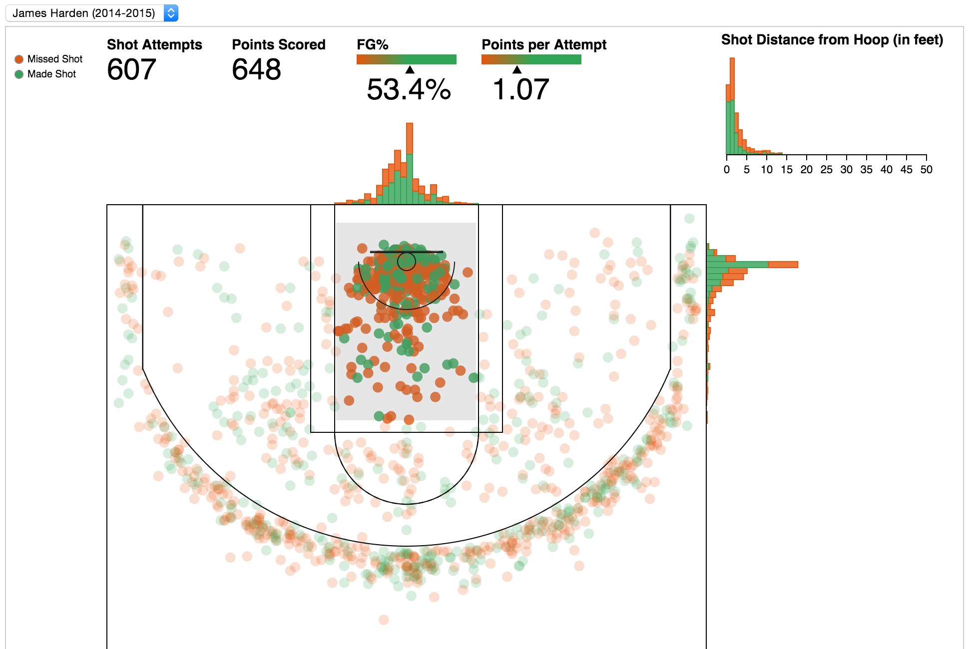
04 Sep 2015Here’s the full interactive demo, the following is just an image!
Motivation
Inspired by @savvas_tj’s post on creating NBA shot charts in python, as well as Kirk Goldsberry’s articles on Grantland, I wanted to prototype an interactive shot chart using vega.
I used vega, because I hadn’t really used it much before and the grammar of graphics model for producing visualizations is super cool and powerful. Also, a recent release of vega added a system for declarative interaction design, which looked like it would make adding interactions easier.
The Data
savvas_tj does a great job detailing the data format, so I’ll just explain what I did with vega to work with the data.
Particularly, I added data for distance from hoop, points scored, the bins to be used in the histograms, brushed field goal percentage, and brushed points per attempt.
The first transformation was to add new columns to the original data, POINTS, MADE_POINTS, hoopdistance, and bins:
{
  "name": "table",
  "transform": [
    {"type": "formula", "field": "POINTS", "expr": "parseInt(datum.SHOT_TYPE)"},
    {"type": "formula", "field": "MADE_POINTS", "expr": "datum.POINTS * datum.SHOT_MADE_FLAG"},
    {"type": "formula", "field": "hoopdistance", "expr": "sqrt(pow(datum.LOC_X, 2) + pow(datum.LOC_Y, 2))/10"},
    {"type": "bin", "field": "hoopdistance", "min": 0, "max": 90, "step": 1, "output": { "bin": "bin_hoopdistance" }},
    {"type": "bin", "field": "LOC_X", "min": -260, "max": 260, "step": 5, "output": { "bin": "bin_LOC_X" }},
    {"type": "bin", "field": "LOC_Y", "min": -50,  "max": 470, "step": 5, "output": { "bin": "bin_LOC_Y" }}
  ]
}
Then I created a new data source that made aggregates for the histograms like:
{
  "name": "distance",
  "source": "table",
  "transform": [
    {
      "type": "aggregate",
      "groupby" : { "field": "bin_hoopdistance" },
      "summarize": {"hoopdistance": ["count"]}
    }
  ]
}
Lastly calculating the field goal percentage and points per attempt:
{
  "name": "percentages",
  "source": "table",
  "transform": [
    {
      "type": "filter",
      "test":  `${ShotChartInteractionFilters.distance} && ${ShotChartInteractionFilters.LOC_X} && ${ShotChartInteractionFilters.LOC_Y} && ${ShotChartInteractionFilters.brush}`
    },
    {
      "type": "aggregate",
      "summarize": {"*": ["count"], "MADE_POINTS": ["sum"], "SHOT_MADE_FLAG": ["sum"]}
    },
    {
      "type": "formula",
      "field": "FGP",
      "expr": "datum.sum_SHOT_MADE_FLAG / datum.count"
    },
    {
      "type": "formula",
      "field": "PPA",
      "expr": "datum.sum_MADE_POINTS / datum.count"
    }
  ]
}
Adding these to the data declaration portion of the vega spec, will now provide data to our visual components that looks like:
// Added columns to the original table
+-----------------------------------------------------------------+
| POINTS | MADE_POINTS | bin_hoopdistance | bin_LOC_X | bin_LOC_Y |
+--------+-------------+------------------+-----------+-----------+
| 2      | 0           | 10               | 60        | 80        |
| 3      | 3           | 25               | 15        | 20        |
| 2      | 2           | 20               | 16        | 12        |
| ...                                                             |
+-----------------------------------------------------------------+


// New table: 'distance' from aggregating the original table
+---------------------------------------+
| bin_hoopdistance | count_hoopdistance |
+------------------+--------------------+
| 0                | 30                 |
| 1                | 60                 |
| 2                | 80                 |
| ....                                  |
+---------------------------------------+

// New table: 'percentages' from filtering and aggregating the original table
+-------------------------------------------------------------+
| count | sum_MADE_POINTS | sum_SHOT_MADE_FLAG | FGP  | PPA   |
+-------+-----------------+--------------------+------+-------+
| 23455 | 30202           | 12000              | .511 | 1.287 |
+-------------------------------------------------------------+
The Visual Components
The visual components for the shot chart break down in to the following sections:
- The court lines
- The shot scatterplot
- The distance and location histograms
- The field goal percentage and points per attempt indicators
The shot scatterplot is made by stating each shot should be drawn as a
circle that is positioned based on the LOC_X and LOC_Y table
fields. This is done in vega like:
{
  "type": "symbol",
  "from": {
    "data": "table"
  },
  "key": "shot_id",
  "properties": {
    "update": {
      "shape": { "value": "circle" },
      "x": {"scale": "x", "field": "LOC_X"},
      "y": {"scale": "y", "field": "LOC_Y"},
      "fillOpacity" : { "value": 0.5 }
    }
  }
}
Each component has statements similar to the above. You declare the data and a mark type that represents how the data will be seen visually. The visual properties like position, size, color, shape are then based on the data or set manually.
Adding Interactions
In vega, interactions are specified as signals that listen to a
stream of events like mousedown, mouseup. They are defined with vega’s
Event Stream Selector
syntax that is similar to DOM selectors.
From these events we extract information like mouse position and then transform that in terms of the data’s values. For example, to add the brush+linking interaction to the histogram component, we first define signals like:
[
    {
      "name": "distStart",
      "init": -1,
      "streams": [{
        "type": "@distGroup:mousedown",
        "expr": "eventX(scope)",
        "scale": {"scope": "scope", "name": "x", "invert": true}
      }]
    },
    {
      "name": "distEnd",
      "init": -1,
      "streams": [{
        "type": "@distGroup:mousedown, [@distGroup:mousedown, window:mouseup] > window:mousemove",
        "expr": "clamp(eventX(scope), 0, scope.width)",
        "scale": {"scope": "scope", "name": "x", "invert": true}
      }]
    },
    {"name": "minDist", "expr": "max(min(distStart, distEnd), 0)"},
    {"name": "maxDist", "expr": "min(max(distStart, distEnd), 50)"}
]
This defines 4 signals to be used as data. The signal called
distStart, listens to a stream of mousedown events on the
distGroup visual component. From the events it calculates the
horizontal position with an expression eventX(scope). This
horizontal position is then mapped to a data value by inverting the
scale that positions a data value to a horizontal position.
Now we can use distStart as a value in formulas, because it has a
value in the data space lifted from the visual space. For example,
the signals from above are used in a filter like:
{
  "type": "filter",
  "test": "datum.hoopdistance >= minDist && datum.hoopdistance <= maxDist"
}
This filters the data for shots that had a distance from the hoop in
between minDist and maxDist.
The shot scatterplot signal is similar, except it listens on events in both the horizontal and vertical direction.
Things to add?
- Add components for other data like “Time left in game”, “Time left on shot clock”, “Distance of Closest Defender”
- Segment the court into defined regions like “Left corner 3”, “Right Corner 3”, “Restricted Area”
- Toggleable hex bin layer to calculate aggregates over the entire court, a la Kirk Goldsberry
- Add filters for the opponent team
- Work with all data from all players from a season
- Add filters for players
- Calculate league averages based on court section, and compare any chosen players based on difference from league average
Thoughts
Working with vega was pretty fun, and I think overall made the process for building this prototype probably quicker than it would have been otherwise.
Last thoughts on using vega:
-
Vega is great as a tool for building a tool to visualize data or prototyping what’s needed in a larger system.
-
It is very verbose, and a composable module for common interactions or visual components would be extremely helpful.
-
Declaring the view components and interactions was easy, but debugging them was hard. There is very little visibility in to what’s going, but if you can trust the system, it works well.
-
Remember to put the appropriate values in the
enter,update,exitproperties on the marks. A couple of times I got stuck on why things weren’t updating on filter changes, but then realized it was because the property was calculated onenterinstead of onupdate. -
Notably much more performant than a simpler React version I played with, even when using Vega’s SVG rendering as opposed to canvas. It looks like React having to update thousands of component’s state incurs a lot of overhead. There may be a better way to perform transitions with React though.
-
vega’s canvas vs SVG rendering, canvas may be smoother but I cannot tell on my machine with a small dataset of this size
-
Using vega’s rendering with SVG, I had some issues getting selections to register and sometimes the selection box would disappear on updates to other selections. I think it is due to vega marking the
rectas dirty when a different selection filtered out all of the data -
Questions:
- How to draw an individual line segment from a data point instead of one path connecting each data point with a line segment.
- How to draw ellipses for the court arcs. Using circles caused the chart to need a specific width/height ratio otherwise the arcs get deformed if the court space gets stretch or contracted from its normal dimensions.